Product design case study
Most of my Figma skills are self-taught. I’ve learned the nuances of nesting layers and creating reusable components on the job. But as a content designer, my product design partners typically handle the more complex Figma work. Which can make proving my skills a bit difficult.
But I’m not just a word nerd, I’m a user flow pro! To showcase my product design skills and Figma knowledge, I decided to build a full app prototype all on my own.
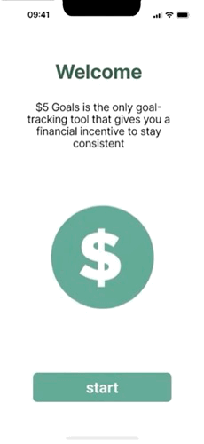
Say hello to $5 Goals, the only goal-tracking app that gives you a financial incentive to succeed!
The problem
If you’ve ever used a productivity app, you know that they don’t work for everyone.
Some people gain new habits and meet goals through positive reenforcement. When they make progress, an app gives them a thumbs up or a celebratory animation, and they get that rush of dopamine that keeps them motivated.
But for me (and many others), it’s the opposite. I’m much more likely to meet my goals if not doing so results in a consequence. A carrot is all well and good, but when it comes to going to the gym or keeping my bathroom clean, a stick is much more effective.
So whenever I download a new productivity app and set a new goal, it’s only a matter of time before I drop off. Because nothing bad will happen if I don’t.
It was time to build an app that was stakes-based instead of rewards- based. Here’s how I did it.
The original idea
My original idea was in hindsight, grandiose. I wanted to build an app that was truly undefeatable.
Not only did I want to swap reward for consequence when motivating users, but I wanted to make it extremely difficult to cheat. If you’ve ever tried one of those app or website blockers, you know what I’m talking about. They’re supposed to prevent you from accessing your most time-wasting apps, but in reality, they’re pretty easy to get around. Either you can just remove the app from your block list, or barring that, simply uninstall the blocker app itself.
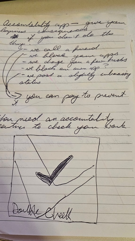
My app would eliminate these loop holes. The idea was that you would set up your account along side an “accountability buddy” that could both confirm you met your goal, and also exact retribution if you did not. The working title of this app was DoubleCheck.
You would have to send your buddy some kind of proof of your accomplishment or progress at regular intervals. If not, your buddy had the power to:
- Permit the app to charge you a small fee ($3)
- Post on social media roasting you for your failure (or let the app create an automated roast-post on their behalf)
- Or simply call you to berate you verbally
This not only meant you had someone holding you accountable, but hopefully it would be a bit fun for them as well.
But 2 things happened that made this plan unviable:
- I realized this system would be extremely complex to build by just one person
- I lost access to the Figma file that stored the early designs 😦
That’s why the only remnants of this idea are these rough, hand-drawn wireframes.

If I wanted to create something usable, I had to shrink my scope significantly.
Scoping and wireframing
I thought to myself: which of these consequences would be simplest to implement? The answer was obviously the small fee. First, it didn’t require the buddy system, which was the main complicator. The user and buddy experiences would need to be very different, almost like designing 2 distinct apps.
And second, the fee was the only option that could be monetized. 😉
Of course, this does leave the app open to cheating: a user could simply lie and log progress without fulfilling the goal. However, this concept is designed to address apathy more than dishonesty. By just forcing a user to confront their progress (or lack thereof) daily, the system still reinforces the goal, which would likely lead to more overall success.
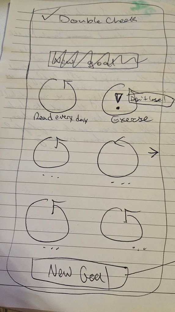
And with my new, more realistic scope, I got to work on a simple wireframe in Figjam.
A few details to note in this wireframe:
- There are 4 main elements to the experience: goal set up, logging progress, goal deletion/editing, and notification settings.
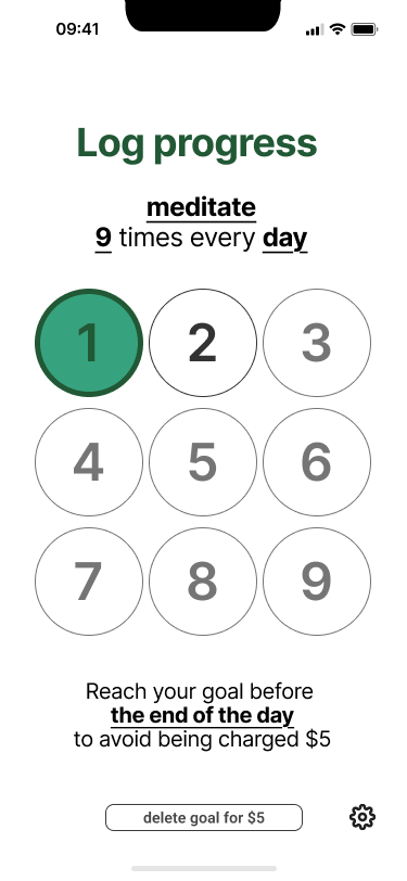
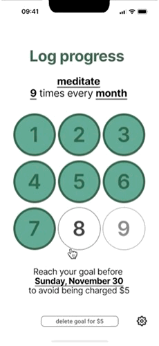
- A user can enter both the cadence (daily, weekly, monthly) and the number of times they must complete the task to meet their goal. For example: Brush your teeth 3 times every day.
- Based on competitors like Habit Bull, I used a “bubble” system for recording goal progress. Not only does it provide an easy way to visualize progress, but tapping those bubbles can be pretty satisfying and add delight to the experience.
- I realized early that the bubbles would not be scalable past 9ish entries. What if someone wanted to let’s say, kiss their partner 100 times per month? For larger numbers, I’d need to create more of a “clicker counter” experience to track progress.
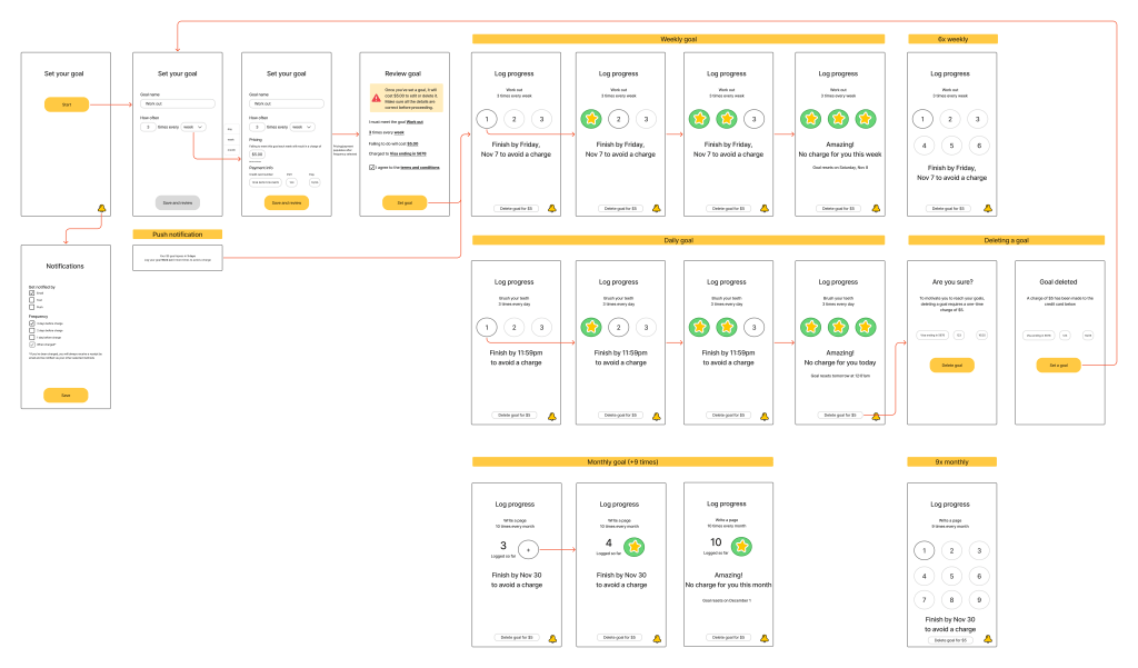
Now that I had a decently detailed plan to follow, it was time to start building the prototype.
The prototype
I embarked on this project to show off my Figma skillz, and for that reason, I wanted it to be as interactive and functional as possible. But to reduce complexity, the prototype can only go to up to 10 instances per daily/weekly/monthly goal.
Play around with the prototype in Figma, or check out the video walkthrough or GIF walkthrough below.
Video walkthrough
GIF walkthrough
Design rationale
To guide me through this process, I came up with a simple design principle: Motivate, don’t distract.
For an app that incentivizes users to meet their goals, I wanted to make sure I added small touches to keep them motivated, without distracting them from the bigger picture. With that in mind, here are design choices I made and why I made them.
1. Aesthetics and colour
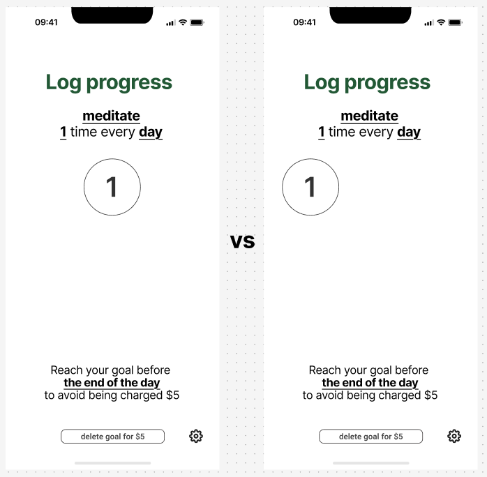
When I started designing the app, I knew I needed the look to match the high-stakes consequence system. I went for a design that was clean and straightforward, focusing on clarity so users could see their progress and the time left to avoid a charge.
Primary green: I chose green as the main colour because it directly connects the design to the theme of financial incentive (green for money). This subtle link constantly reinforces the serious nature of the goal.
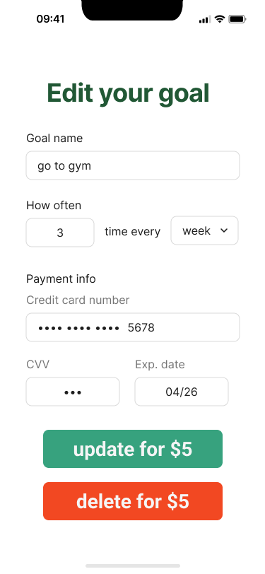
Warning contrast: I chose red as a high-contrast colour exclusively for actions that incur a charge. This draws the user’s eye immediately without unnecessary distraction. Right now it’s only used for the goal deletion flow but I would consider using it elsewhere if user testing showed it was needed.
2. Copy and tone
I had to be strategic with the content. I wanted the copy to feel motivational but with a slight, playful edge of critique to align with my stakes-based strategy. A “playful stick,” if you will.
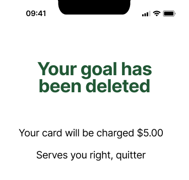
The critical edge: I made sure to add moments of sharp copy to reinforce the consequence. For example, when a user deletes their goal instead of completing it, the app calls them a “quitter.” This adds playful humour to add delight while being much more memorable than a traditional confirmation message.
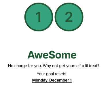
Clarity first: All copy is super clear to make sure the user always knows exactly how many times and how often they need to complete a task. The on-brand replacement of S’s with dollar signs ($) is also only reserved for delight moments, and not anything that contains critical information.
3. Motivational moments (delight)
While I designed the app around the stick, I couldn’t ignore the carrot entirely. I added small moments of delight to make the app satisfying and rewarding when a user does succeed.
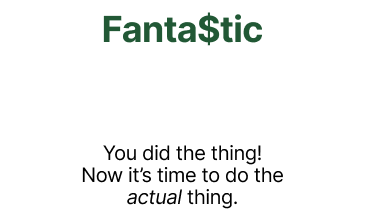
Celebratory copy: When a user completes a goal, they get copy that reflects the success (like the “Awe$ome” example above) to re-enforce that positive behaviour. Using the dollar sign ($) also keeps us in the theme of monetary motivation.
Bubble system: I went with a “bubble” system for logging progress. Tapping those bubbles is surprisingly satisfying, much like popping bubble wrap. And the visual change adds delight to the daily task of logging progress. If this ever became a published app, perhaps I’d explore adding haptic feedback to make tapping those bubbles even more satisfying. Notice how the colour differences between green, black, and grey show the states of complete, current, and incomplete.
Animations: I played around with animations to bring that extra something special to the experience. Transitional screens (like the screen between the setup flow and the progress flow) are treated to a fun, dancing dollar sign logo. When a goal is fully completed, I made a small star animation pop up on each bubble, giving the user an instant, positive confirmation that they successfully avoided the charge.
Figma deep dive
Making the prototype as functional as possible meant that I had to dive deep into advanced Figma tools. Here are some of the coolest/most complex things I created to bring this prototype to life.
Mini design system (bubble components)
If I wanted the bubble tracker to function as intended, it had to be scalable for any user input from 1 to 9. This meant using multiple layers of nested components and Auto Layout to make the progress log UI adapt to whichever number the user chooses.
Here’s how each layer works.
1. Foundational component (the bubble)
The most basic component of the bubble system would, of course, be the individual bubble. This would become the foundational component, with the other layers built on top of it.
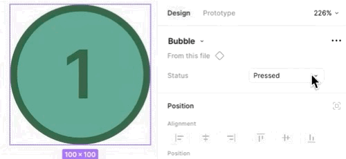
Status variants: Each bubble can be adapted to 3 different variants (pressed, enabled, and disabled). These variants provide a visual distinction for bubbles that have been “popped” and makes it easy to assess progress at a glance.
- Pressed: shown in the branded green tones to show completion once a bubble is “popped”
- Enabled: shown in white with black text/outline to indicate the next available bubble to pop
- Disabled: shown in white with grey text/outline to indicate bubbles that are not yet able to be popped (the enabled bubble must be popped first)
- As the user progresses, the proceeding bubble also updates to the enabled state, giving a clear indication of what number you’re on (e.g. As the 1 bubble is pressed, the 2 bubble updates to enabled from disabled).
This layer also ensures that any visual change to bubbles (like colour or border radius) only needs to be updated once in the master component, and will propagate across the entire app prototype.
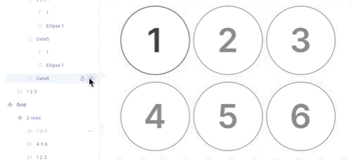
2. Middle component (the row)
The next challenge was to make sure that any amount of bubbles (1-9) could be populated in an aesthetic and intuitive way. For example, if a user wanted to complete their goal once per day, it would look and feel strange for that bubble stay left-aligned (where it sits in the full 9-bubble grid).
This is why I needed to create 3 row components (1-3, 4-6, and 7-9) to make sure bubble placement could be adjusted within each row.
Row construction: Components representing row of bubbles are 3 instances of the foundational bubble component, grouped together. Each bubble within a row can be toggled on or off, adjusting the position of each bubble to keep them centre-aligned within the grid.
Auto Layout: Crucially, these groups use Auto Layout to make this work. Each group has:
- A defined gap of 5 pixels, ensuring perfect, consistent spacing between the bubbles
- Setting row width to Hug to automatically shrink the row’s width when a bubble is hidden
- Each row is centre-aligned within the overall grid to snap visible bubbles back to the centre
This ensures I can quickly and easily design multiple flows that call for 1 or 2 bubbles in a row instead of all 3.
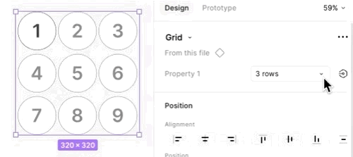
3. The container layer (the grid)
Both the bubble and row components are contained within one, overarching layer: the grid. This component organizes multiple rows so I can easily display numbers up to 9.
Grid structure: The grid is an Auto Layout frame that stacks up to 3 nested row components vertically.
Row variants: To easily adapt to different counts, the Grid is built with component variations. The designer can select a variant to instantly adjust the layout to show 1, 2, or 3 rows as needed instead of hiding/unhiding individual bubbles.
Flexibility: Adjusting the total bubble count (e.g. from a 3-count goal to a 6-count goal) is handled by swapping out or changing the visibility of pre-built rows and/or bubbles within the parent grid. This avoids manually adjusting elements whenever the goal duration or count is changed.
Clicker counter experience (10+)
But even with these cool nested components and complex Auto Layouts, the bubble system would not be scalable past ~9 entries. While my prototype only goes up to 10, a user could hypothetically any number, and there’s no design that will hold an infinite amount of bubbles.
For users who enter a number of 10 or higher, we’d have to abandon our bubble-popping interaction and switch to a simpler “clicker counter”-like experience. This would primarily be used by people with monthly goals, since a daily or weekly goal above 9 instances would be unlikely (and very hard to do). Plus double digits seemed like a natural cut-off point.

Prototyping with conditional logic
Now I had the mini design system I needed to create any logging experience up to 10, I wanted to make a functional prototype. But in order to land the user on the right progress screen with the right content, I’d have to set up dependencies to guide them there.
The 2 major conditional moments are:
- Selection between daily/weekly/monthly goals: determines the textual content and due date on the progress screen
- Number input: determines the number of bubbles to show on the progress screen, or whether to transition to the clicker counter
Here’s a simplified, high-level diagram of how it works:
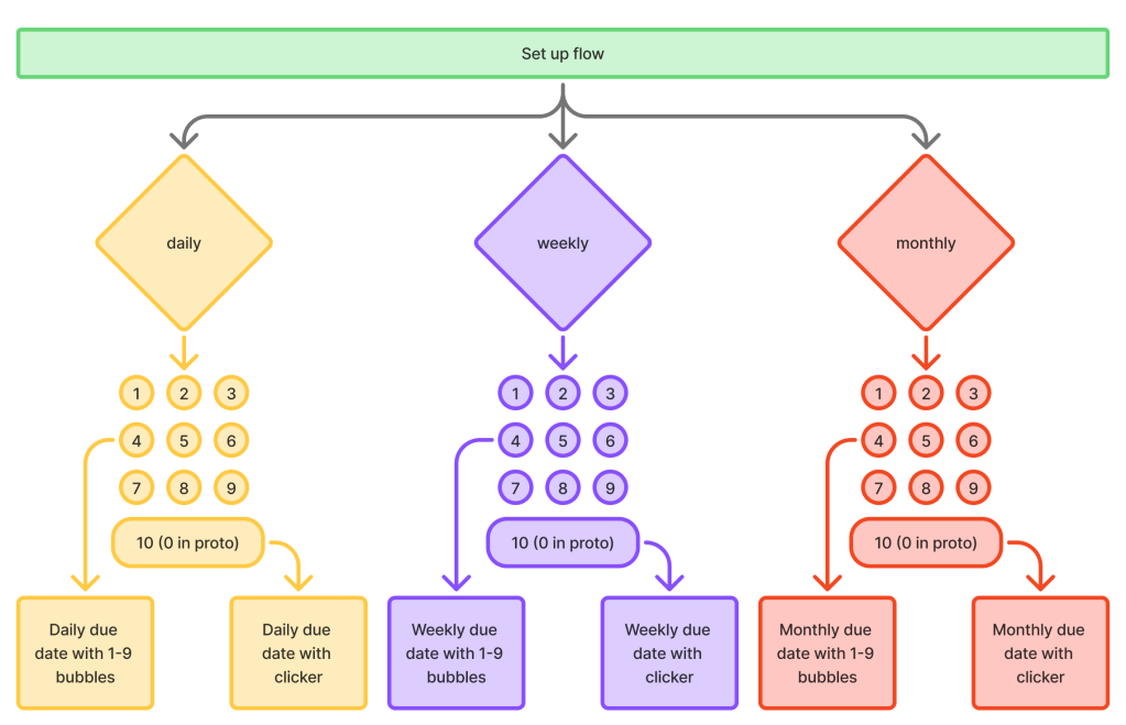
But of course, in the prototype, each 1-9 bubble would need its own dedicated screen to link to. If you do the math, that comes out to 30 semi-unique progress flows. That makes it waaaaay more complicated in Figma.
And that’s why we have the diagram!
Conclusion
My initial challenge was simple: to prove I wasn’t just a content designer. Building the $5 Goals prototype was my answer. This exercise became a masterclass in strategic descoping, complex component nesting, and advanced Auto Layout. What began as a technical self-challenge ultimately became a full (if small) product design system.
Key takeaways
The primary success was translating my design principle of “Motivate, don’t distract” into a functional, clean interface. This really made an impact when it came to working with Figma’s component architecture:
- Dual tracking system: Recognizing that the bubble system was not visually scalable, the app pivots to a more space-efficient clicker counter experience for goals requiring larger numbers (10+).
- Adaptable visualization: Using a 3-layer nesting system (Bubble > Row > Grid) provided a flexible component that can adjust the progress visualization for any goal count from 1 to 9.
- Visual feedback: The bubble system and animations successfully delivered small moments of delight and positive confirmation to users, making the task of logging progress satisfying but without distracting users from their goal.
Future scope
For now, $5 Goals is just a prototype. After all, it would be unrealistic to be a world-class content designer, amazing product designer, AND a capable software engineer.
But if I was, here’s where I would be looking next:
- User testing: Does this stakes-driven system help motivate people more than all the rewards-driven apps out there? Does the failure fee scare them off? What design changes might make them more comfortable?
- Visual design: For this prototype, I prioritized system architecture over visual polish. If I continue to iterate, I’d look more deeply into visual design best practices and find the most visually appealing ways to present information.
- Enhanced delight: To make tapping the bubbles even more satisfying, I could explore adding haptic feedback or sound.
- Ambitious “DoubleCheck” system: The ultimate next step would be to return to my original, more complex concept of integrating the “accountability buddy” system to leverage social motivation and consequence. This would also be a good concept to explore in user testing.
My reflections
As someone who doesn’t dive into Figma’s more complex tools on a daily basis, this was an invaluable challenge. Most of the know-how was already in my brain, but building it was much more complicated than I expected.
Scoping down early was the right call. Even with this relatively simple concept, making it fully functional (or as close as possible) as a Figma prototype was insanely complex. Creating a mini design system, the combo of bubbles and clickers, mapping flow logic required quite enough effort on their own, thankyouverymuch.
But with this case study in my back pocket, no one should ever ask me if I truly know Figma ever again. And if they do, they’re in for an earful.
Want to see more?
Check out my other case studies or learn a little more about me.
 Maria the Copy Cat