Content design case study

Facebook, Instagram, and the others in Meta’s family of apps bring in a whopping $110+ BILLION in ad revenue every single year. How do they do it? With amazing algorithms and other technologies that accurately match the right ad content to the right users. But none of that can happen without using certain information about users to match them with the best possible ads. That’s where the ‘Activity Information from Ad Partners’ setting comes in.
This setting serves 2 main functions:
- Inform users about this type of data and how it can be used to improve their ads
- Allow users to choose whether or not they want this data used
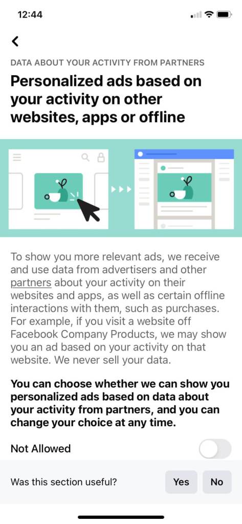
Simple enough, right? WRONG. Meta’s data flows and usages are extremely complex and not easy to understand (even for someone who works there). Plus, since this particular type of user data comes from 3rd parties, its collection and use is controversial and subject to strict regulations and scrutiny. Revamping this control to meet new (and still evolving) legal standards would be my most biggest content design challenge yet.
The problem
What wasn’t a problem in this revamp?
Problem #1: Legal compliance
With data privacy regulations evolving, Meta needed to completely revamp this setting in order to meet these new strict standards. The original content was not nearly detailed enough and also hid a lot of critical information behind links and drop downs.
The new standards are extensive and prescriptive, covering everything from what we can call the setting, to where certain details must be placed, to how we could describe the effects of turning it on or off. A lot was going to have to change.
Problem #2: Revenue maintenance
This data directly contributes to Meta’s massive ad revenue, the largest portion of Meta’s total revenue by far. Therefore, an ad setting that did not explain or emphasize the benefits of personalized ads could lead to more opt outs, which would be detrimental to the business.
And while the benefits of personalized ads are real, promoting or describing those benefits in certain ways conflicts with the legal standards we were trying to meet. Balancing these two ends of the seesaw would be tricky.
Problem #3: Usability, of course!
Last, but certainly not least – what good would this setting do if users cannot understand it and use it easily? The original content was not up to the Meta content design community’s high standards of writing with clarity and humanity. Amidst the tension between our legal and business objectives, I would also have to design usable, transparent content that describes how the data is used in a way the average user could understand.
Without this, the user’s decision would not be well-informed and would detract from the meaningful consent we were trying to achieve. And as an advocate for user-first design, this was non-negotiable.
The new user flow
The revamp of the ‘Activity information from ad parters’ setting took an entire year of iterations, with disagreements over everything from the overall flow to how sentences were structured. I’m not exaggerating when I say that there was a new iteration of this setting nearly every single day.
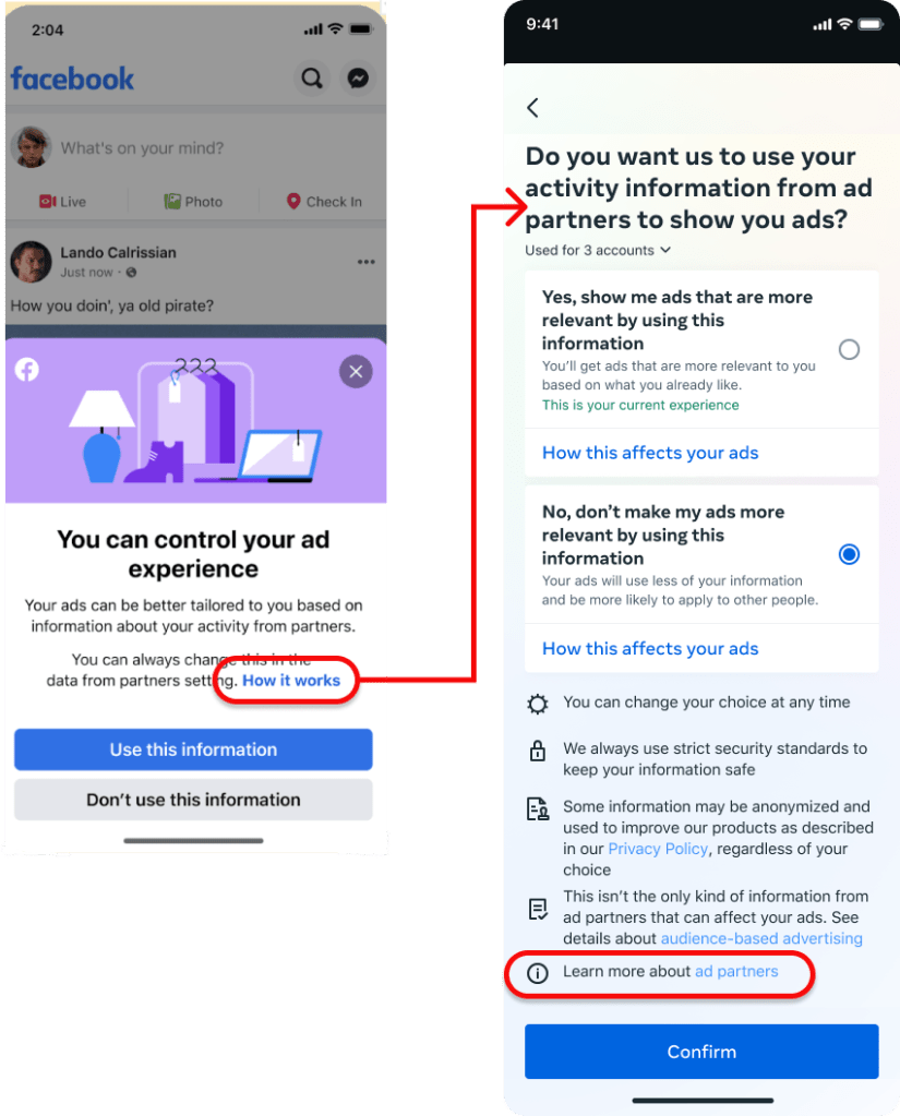
For that reason, it’s much easier to show you the end result first and then explain how we got there. Here is the basic user flow:
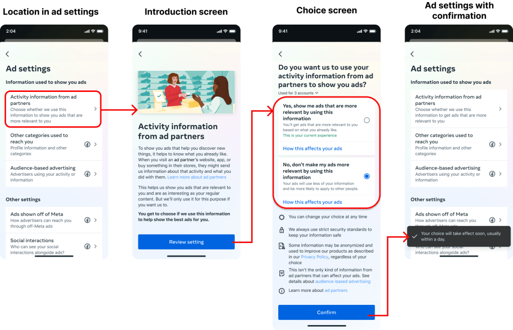
This is the end result of countless decisions from product design disciplines, UX research, legal teams, and business partners. But throughout these many decisions, I kept the user at the forefront by defining and following a specific content strategy.
I organized this strategy into 5 main pieces.
The content strategy
A detailed problem needs a detailed strategy. Use the links to jump to each piece.
| 1. Information hierarchy and progressive disclosure | How do we organize and share such a large amount of complex information in a digestible way? |
| 2. Build trust with simple, human language | How do we break down this complex data system into terms anyone can understand so they can feel confident to make this decision? |
| 3. Identify the right value prop with research | How do we communicate the value of personalized ads while meeting our regulators’ requirements? |
| 4. A more clear, intuitive consent UI | How can the UI help support content and provide a clear choice to the user? |
| 5. Holistic integration into the larger ecosystem | How to we create a design that fits into all the places this consent moment can appear? |
Let’s dive in!
Information hierarchy and progressive disclosure
We were legally obligated to disclose a LOT of information to users in this setting. Here are just a few examples of the legally-required disclosures:
- Examples of how this setting can affect the user’s ads
- A definition of “ad partners” that includes a comprehensive list of examples
- The other settings that control different types of 3rd party data
- And more!
How do we adequately describe how this setting works while still including all this extra information without overwhelming the user? Through careful information hierarchy and progressive disclosure.
Information Hierarchy
When communicating such a large volume of complicated information, I wanted to lead with the most important and valuable items that the user needs to know.
- About this setting: What is ‘Activity Information from Ad Partners’?
- Details about this setting: How does turning this on or off affect my ad experience?
- Details beyond this setting: What else should I know?
Due to the volume of information, I recommended adding an introduction screen before the user makes their choice in order to have space to clearly explain how this data works without overwhelming the user.
This diagram shows how the content prioritizes the information hierarchy above:
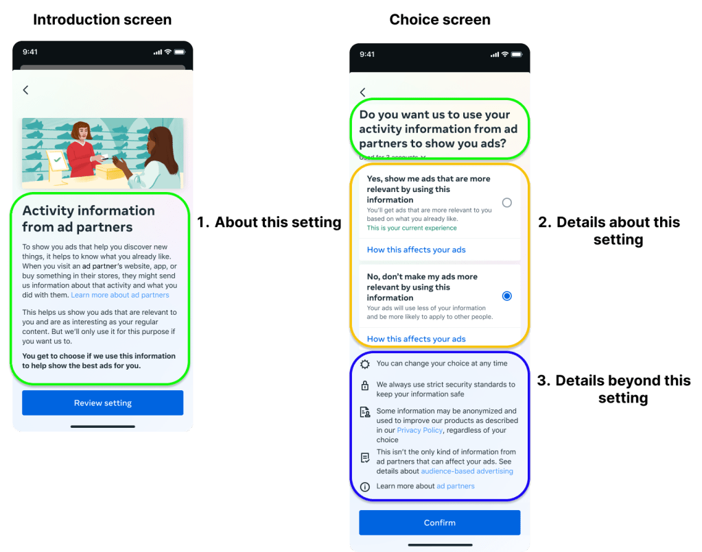
The introduction screen gives the basic info you need to understand the setting. The choice screen gives more details about your ad experience above the fold. And the legally-required details that are not specific to this setting are available below the fold.
Progressive Disclosure
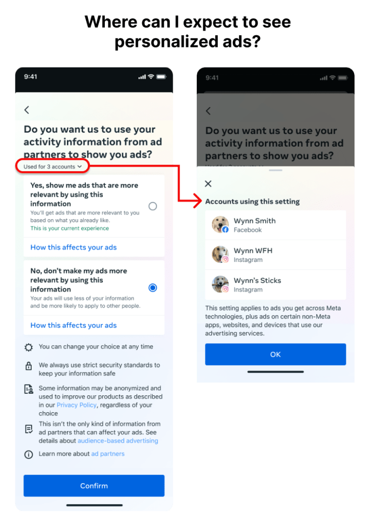
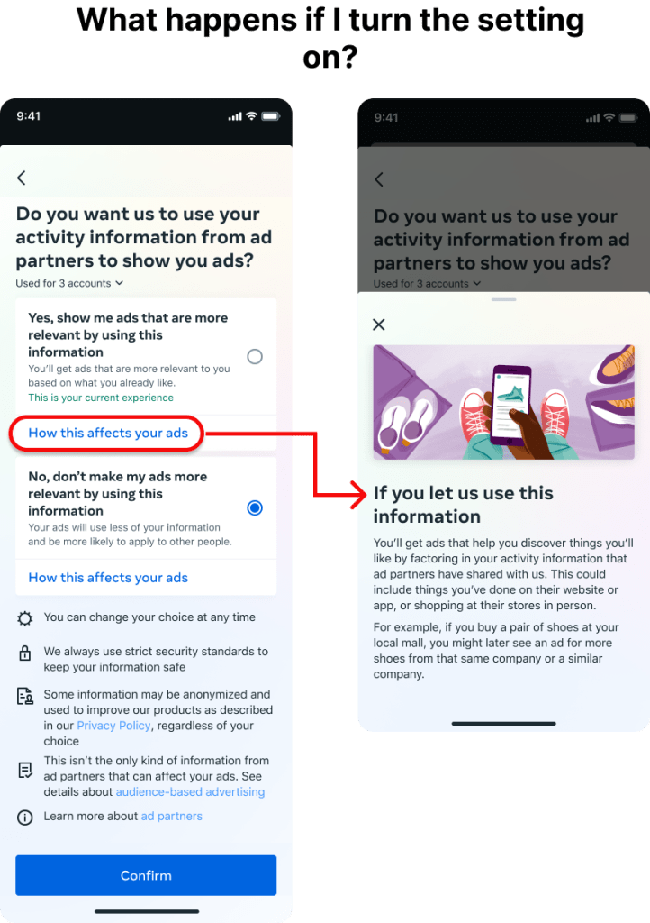
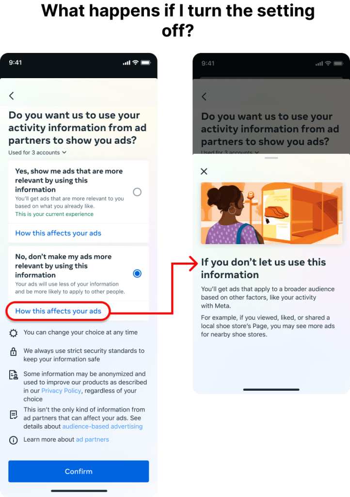
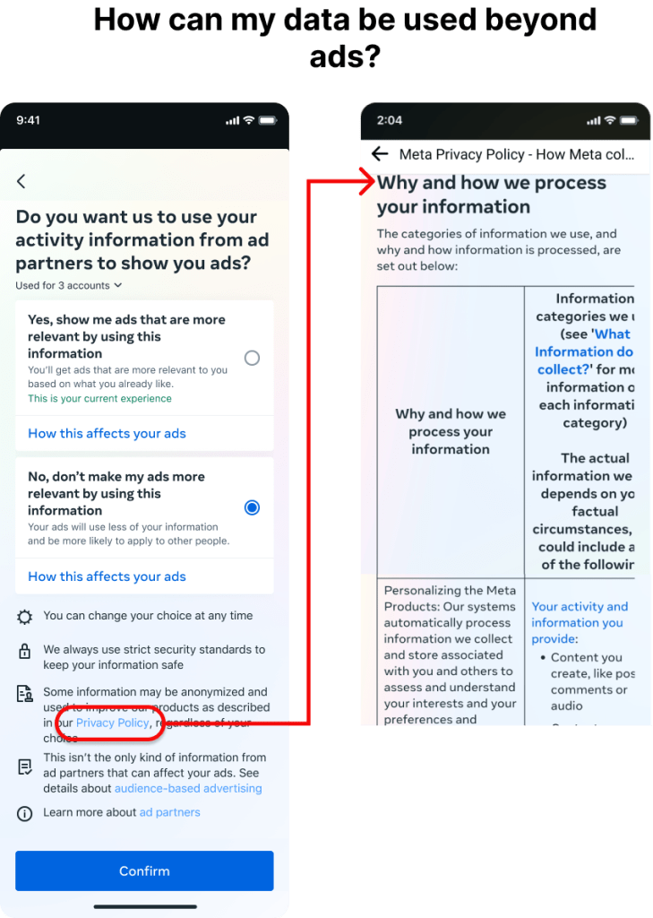
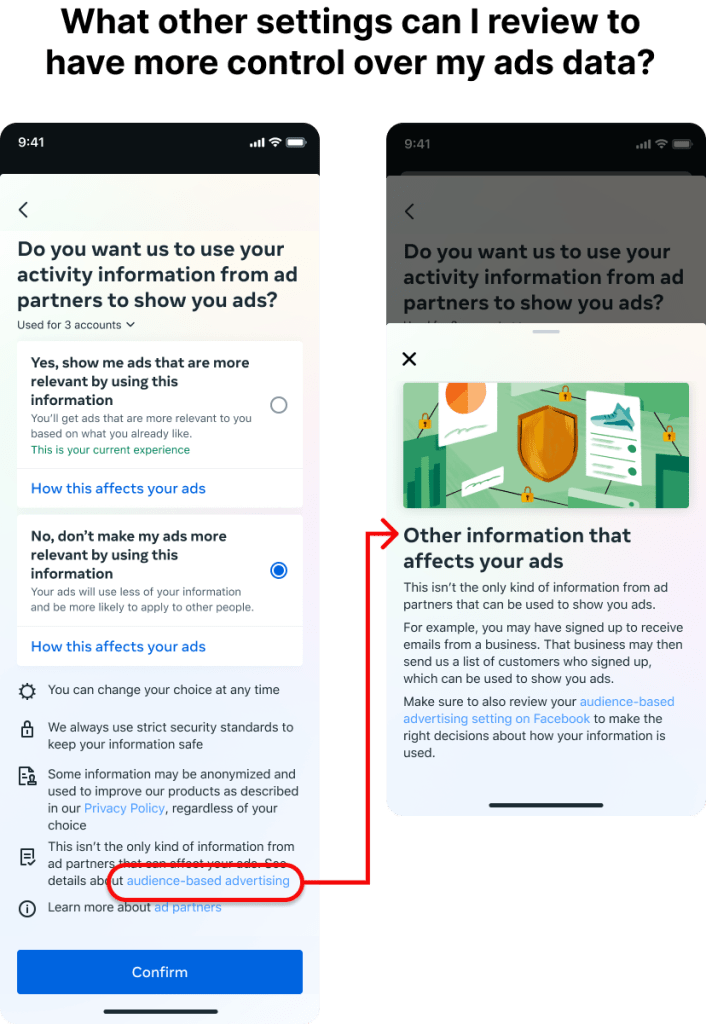
But there was a lot more details that we had to provide to make this setting compliant. That’s why whenever it was legally permitted, we used progressive disclosure to let users choose what extra details they wanted to see, piece-by-piece. Depending on what was appropriate for each item, we either linked out separate pages or used bottom sheets to provide those details.
Move through through this slideshow to see where each link leads:
Build trust with simple, human language
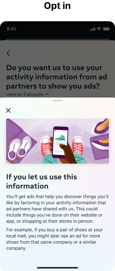
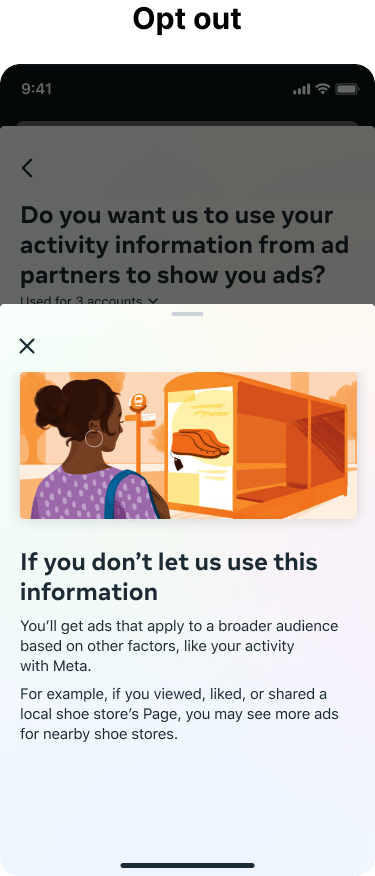
Even with the information organized and parsed out, it’s still pretty complex and technical for the average person. That’s why I made it a priority to use the most simple, human language possible. I also created relatable, everyday examples to illustrate the concept.
Simple, human language
The introduction screen was critical to clearly explaining this setting. Not only did it give me the space to use human language instead of tech jargon, but it also forces the user to slow down a little to absorb this information and understand this is an important decision.

Some of my favourite examples include:
- “it helps to know what you already like”
- “they might send us information about… what you did with them”
- “ads that are… as interesting as your regular content”
- using “information” instead of “data” (based on UX research)
I also used human-centric language as an opportunity to build trust with users. Meta doesn’t have the best reputation when it comes to user data, so I used word choice and tone to make it extra clear that users have control and a choice.
- “But we’ll only use it for this purpose if you want us to.”
- “You get to choose if we use this information to help show the best ads for you.”
Everyday examples
Since it can be hard to show how using this data will affect you, I advocated for using examples whenever possible. I chose shopping for shoes as a common, everyday example that just about everyone can relate to. By selecting the “How it works” link on either setting option, the user can get a brief explanation and example of how their ads might change if they opt in or out.
Identify the right value prop with research
It’s no secret that this setting has a huge impact on Meta’s revenue. So naturally, our business stakeholders wanted to be sure our design was communicating the value of opting in. However, our regulations were very strict in how and where we could use value props. They had to:
- Be legally defensible through metrics (e.g. saying your ads would “improve” would be too subjective to defend with numbers)
- Not be leading, which meant we could not place them too prominently (e.g. we could not include a value prop in main headings or the consent question)
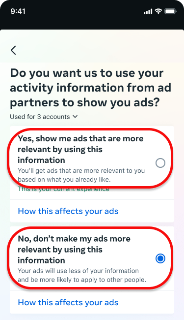
But as a content designer, I wanted the value prop to accurately communicate how this data affects ads. Research showed our previous descriptor of “Personalized ads” was not clear to users, so chose “Relevant” as the best option to satisfy all 3 goals.
The “Relevant” value prop had:
- research to show it improved user comprehension above “personalized”
- research to show it best communicated the value of opting in above other terms we considered
- supporting metrics that could defend the claim in a legal context
A more clear, intuitive consent UI
Communication doesn’t just fall to content design. I worked closely with a talented product designer to ensure the UI could support the information architecture and help the user move through the flow intuitively.
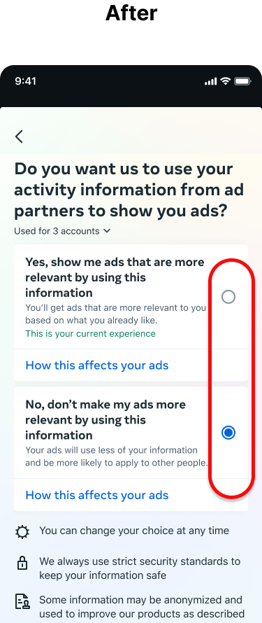
Radio buttons
One of our early research findings was a big one: users found the previous setting’s use of a toggle difficult to understand. Which way was “use” or “not use”?
So for the new design, we chose radio buttons over the toggle. Not only did user tests show users found this format easier to understand, but it also gave us a little extra content space to explain each option’s effects (and squeeze in those value props).

Holistic integration into the larger ecosystem
Yay! I had a design that worked for users, the business, and legal. But there was one more thing to do.
Because this setting is so critical, slightly-altered versions of it pop up in different places in the Meta ecosystem. That meant we’d have to make more iterations for this setting to fit these places for a consistent, holistic experience.
Standalone setting for inline experiences
To make this setting easier to access, Meta has several inline experiences. When a user is having an ad-related experience (e.g. if they hide an ad because it’s not relevant to them) they can be prompted to update their ad settings in the moment.
This means the user needs fewer taps to access the right settings to improve their experience. But inline controls were legally required to link directly to the choice screen of the setting. That meant no intro screen.
Luckily, this was easy to fix. The only legally required piece of information on the intro screen was the link to the definition for ad partners. While it may be a little redundant to users in the main setting, this meant we could have a compliant standalone setting for these situations. And we could always rely on the inline control to provide any needed context.
Onboarding flow for super-regulated regions
The results
Somehow, I did it! I created a strategy, design, and content that was legally compliant, communicated the value of personalized ads, and made this complex information more clear for the average user.
As of 2023, this revamped setting has launched to billions of users around the world so they can have a meaningful understanding of how their data is used for ads, plus the means to provide their consent or not. And for those who do want more relevant ads, this setting facilitates the tens-of-billions in ad revenue that Meta generates each year.
How’s that for impactful design?
If you have a Facebook or Instagram account, you can review the ‘Activity Information from Ad Partners’ setting under: Accounts Center → Ad preferences
Want to see more?
Check out my other case studies or learn a little more about me.

