Content design case study
As the public provider of auto insurance for all residents of British Columbia, ICBC has a lot on its plate. From issuing policies, to managing claims, to drivers licensing and vehicle registration, there’s a lot of complex topics to communicate to customers from all walks of life.
So when staff raised concerns that customers had a lot of confusion around the claims process after they’d been injured in a crash, it wasn’t a huge surprise. But as a temporary digital content strategist new to the team, I knew this was the perfect opportunity to make a positive impact during my short 3-month contract.
Let’s get this show on the road!
The problem
Navigating the insurance process after being injured in a crash is never fun. But it’s especially painful when you have to wait on the phone to talk to an insurance rep to get the plain, clear answers you need. And that’s exactly what ICBC’s frontline staff brought to my attention shortly after I joined.
These support specialists identified 3 main pain points of our customers:
- Understanding terms and concepts:
ICBC was using a lot of insurance jargon to describe the treatment and recovery process. - Understanding the overall injury claims process:
Any kind of insurance process can get complex fast. Customers didn’t have a good understanding of the high-level process, like how long the process takes, what they need to do next, or how any additional policies might replace or augment their ICBC coverage. - Understanding their benefits and eligibility:
As a combination of the first 2 problems, customers had trouble understanding what different benefits were, whether if they were eligible, and what documentation they needed to apply.
In other words, customers were confused and had a lot of questions! And answering them was taking up a lot of the frontline staff’s time, leading to longer waits on hold, and a more negative opinion of ICBC.
With my work cut out for me, my goal was simple: revamp the post-crash and injury benefits section of ICBC.com to simplify the content, provide more clarity, and proactively address these pain points before they got to the support specialists.
The content audit
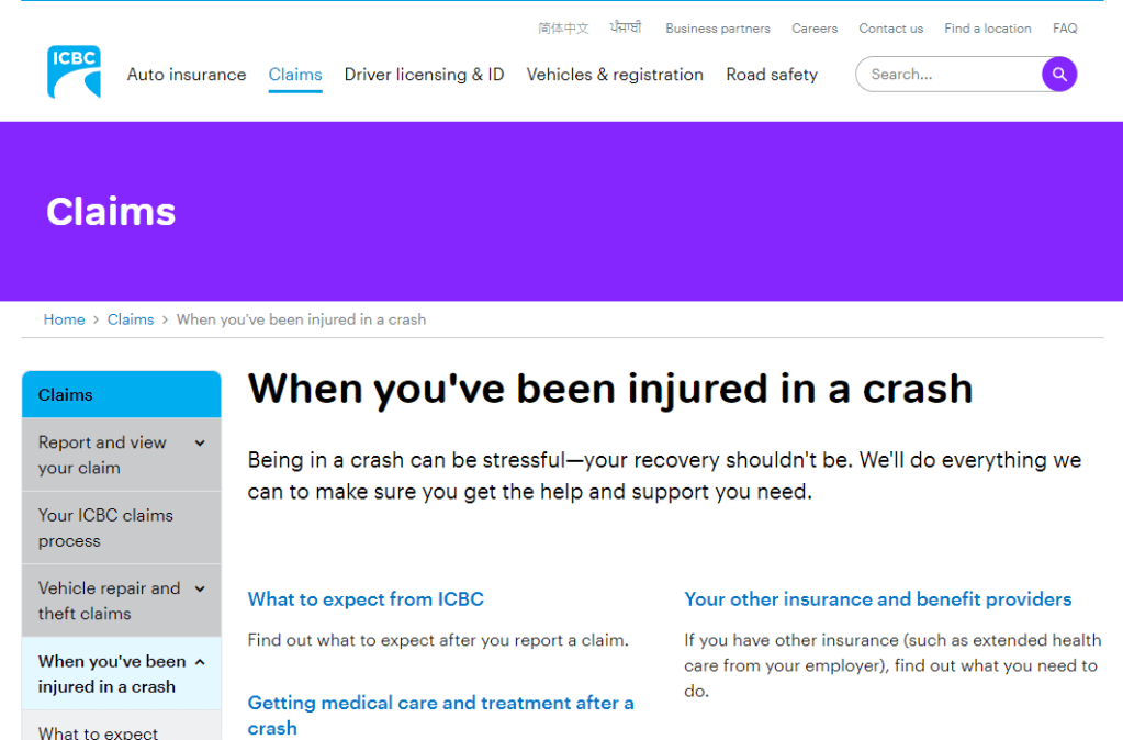
I approached the problem the way I always do: empathizing with the customer. I carefully combed through each page in the injury claims section (When you’ve been injured in a crash) to identify where content was unclear and what terms could be changed or better defined. As a newcomer to ICBC, it was easy to remove myself from the internal mindset and move through the experience like a customer.
As I audited, I began to make a few observations. And then a few turned into many.
Here are my 7 observations:
- Topics were not always presented in chronological order:
One page provided a CTA to report your claim, but further below mentioned that if your crash occurred on the job, that claim should instead go through WorkSafeBC (an insurer of workplace accidents). That would have been good to know before I started my claim! - Titles and labels were not always an accurate description of the content:
A page titled What to Expect from ICBC included information about interacting with WorkSafeBC and auto body shops. That’s good to know, but not what I came here for. - Content was not always contextual or consistent:
Different forms to fill out were often linked on pages with no context or guidance. Sometimes different terms were used to describe the same concept (e.g. health care practitioner / health care provider). - Information architecture was inconsistent and poorly defined:
Some topics were mentioned across multiple pages, making it hard to know where to go to find the source of truth or most complete information. Page organization was also inconsistent, making findability vary from page to page. - The tone of the writing sometimes came across as unsupportive:
The page that outlined death benefits was titled When there’s been a fatality. The use of “fatality” here felt strangely clinical and harsh in such a personal and delicate context, which was not in line with ICBC’s brand voice. Even minor injuries can create stress and trauma, so the appropriate tone was super important for these pages. - Information could be simultaneously redundant and incomplete:
A page outlining injury benefits only mentioned 2 items: medical care and income assistance. Not only was this list incomplete, but each of these benefits had a dedicated page with more comprehensive info. So what was the point of this page? - Vague and euphemistic language raised more questions than they answered:
For more severe injuries, a customer can apply to extend their coverage period. The page detailing this was titled When your recovery isn’t going as expected. Euphemisms like this are confusing, especially when they don’t mention the actual topic at hand: the length of your coverage period.
But there was a clear theme coming through in these observations: while there was a lot of work to do on terminology and tone, the root of the issue lied in the section’s IA and the findability of these topics.
The content strategy
Now that I had seen the experience for myself, the path forward became clear: a complete overall of this section of the website.
I communicated this to my team and stakeholders with a 3-point content strategy:
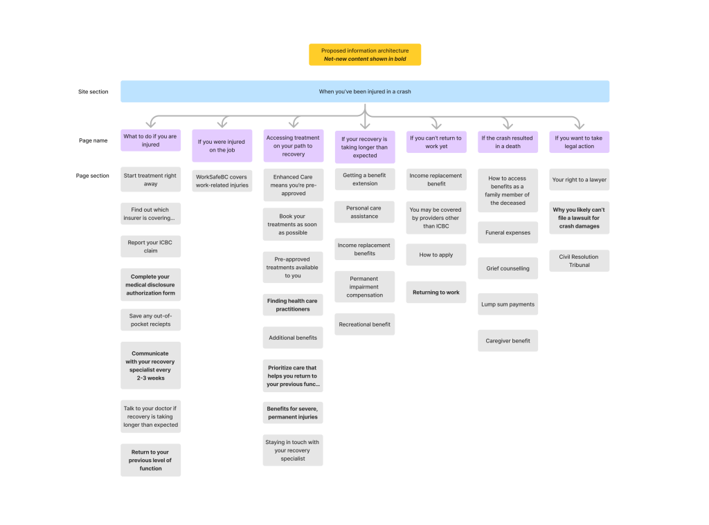
- Reorganize and relabel current and net-new topics into a clear and intuitive information architecture:
- Group topics into the right pages and categories for easier navigation
- Relabel page and section titles to be more intuitive and contextual
- Define and establish a page structure that provides context and structure to each topic:
- Identify what information should be prioritized or visually emphasized within a page
- Establish a content pattern that can improve consistency across pages and let customers easily find the most relevant information
- Rewrite content on each page for clarity and tone:
- Revise complex phrases and terms that may not be serving our customers
- Ensure terminology choices are consistent across pages and topics
- Take opportunities to align content with ICBC’s voice and tone (straightforward, knowledgeable, collaborative, and supportive)
For this case study, I’ll be focusing on parts 1 and 2 of this strategy.
An intuitive IA
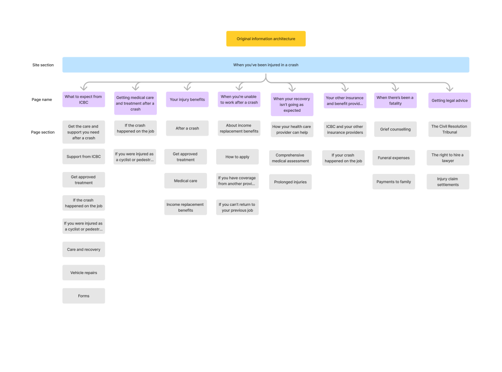
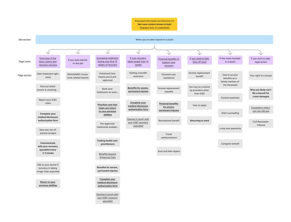
With my list of old and new topics, I got to work designing a more clear and intuitive IA to help customers navigate to the right place. Below you can see a before and after.
A consistent page architecture
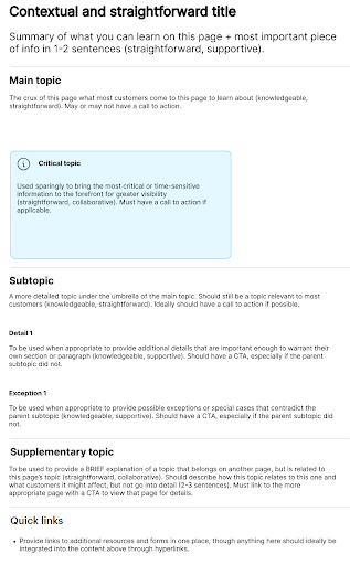
But navigation doesn’t end at high-level topics. That’s why part 2 of the strategy was to create a structure that could be used across pages. It focused on providing context for topics, emphasizing the most important pieces of info, and how to refer to related topics without being redundant or overwhelming.
Below you can see the page structure I provided to the team.
The team was excited – this all looked great! No one had taken the time to strategize IA this deeply before.
But would ICBC’s customers agree? It was time to find out.
Validation through tree testing
Since this new IA was such a big change, the team and I decided to validate it with real ICBC customers. Because the main issue with the previous IA was findability and labeling, I identified that a tree test would be the best testing method.
To target ICBC customers, we decided to send the test to our consumer insights panel – customers who have agreed and are used to receiving surveys from ICBC.
To make sure the IA was improving and not just shuffling info around, we first tree tested the original structure, then compared its findability to the new one.
We selected questions based on the key pieces of info we knew customers had trouble with, like:
- Overall steps of the process:
You were recently injured in a crash, but you don’t know much about ICBC injury benefits or where you should start. Where would you look for information on steps to take after an injury? - Financial support benefits:
You’ve been off work to recover from a crash injury and are being compensated by ICBC for your lost wages. This week you noticed that your benefit amount is less than usual. Where would you go to find out more about your wage loss compensation? - Catastrophic injury benefits:
You’ve read about some benefits that only apply to really serious injuries, but you don’t know if your injury qualifies. Where would you go to find out?
The tree test
But these initial tests didn’t go as I planned… while many questions saw significant jumps in findability, many remained stubbornly low (with one even decreasing!) Where had I gone wrong?
The issue became more clear once I started reading the verbatim comments left by customers. They were startling to say the least.
“This entire questionanaire [sic] made no sense at all“
– Anonymous customer
Ouch. As a content designer, that’s the last thing you want to hear.
After nursing my ego back to health, I had to find out why. I did a deep-dive into more verbatim comments and the disappointing results.
A deeper look at user testing
After looking more closely at the results, I noticed some patterns emerging. I recorded my insights and observations based on customer behaviour, then provided recommendations to resolve these issues.
Insight 1: Language in certain labels were too vague or too broad to be helpful
| Behaviour | Observation |
|---|---|
| On questions with high failure rates, customers often chose the same incorrect labels: – What to do if you are injured – Accessing treatment on your path to recovery | These labels are broad enough to cover almost every aspect of the post-injury process – to be helpful, the language must be more specific to differentiate it from other content |
Recommendation 1: Adjust this language to be more specific to the page’s content and exclude other content
Insight 2: Specific choices in microcopy led to misinterpretations
| Behaviour* | Observation |
|---|---|
| The question prompting customers to find the section on extending their coverage period led many to an incorrect label. – Correct label: If your recovery is taking longer than expected -Incorrect label: If you can’t return to work yet | The word “yet” may have been interpreted as needing a longer time period. Customers may have seen this option first and assumed it was correct. Additionally, both of these labels are problematic for more severe injuries: many customers may never be able to return to work, and long-term care may be well within expectations. |
*This was one example of many similar issues with microcopy in labels.
Recommendation 2: Replace or remove these problematic terms and phrases to increase accuracy and differentiate from similar-sounding labels.
Insight 3: Customers did not realize this was meant to represent a website structure!
| Behaviour | Observation |
|---|---|
| In addition to the quote above, may verbatim comments expressed confusion with the tree test itself: – Comment 1: “but [there’s] no ‘other’ or ‘need more support’ choices” – Comment 2: “none of [the topics] seem to be addressed” | These customers did not seem to understand that the tree is meant to represent the structure of a website and pages. Comment 1 seemed to think it represented phone tree options, while Comment 2 expected to see the full content at the end of the tree. |
This insight was perhaps the most important – of course customers aren’t going to behave as hoped if they’re not clear on the objective! After reviewing the instructions, I realized that we had used our testing platform’s generic instructions for a tree test, which perhaps was not as detailed or contextual as our customers needed.
Recommendation 3: revise the language in instructions and questions to provide more context and be clear that this is for a section of ICBC.com.
This was such an important insight for me. While focusing so hard on making in-product language clear and contextual, I neglected to put that same care and thought into the test instructions.
Lesson learned:
A usability test is its own kind of user experience, and it needs the same level of empathy to be effective.
Iterating the information architecture
In addition to fixing the issues with the tree test instructions, I made some tweaks to the IA to make certain topics more visible and findable. I also made revisions to the labels to make them more specific and accurate.
Here are some examples:
| Before | After | Rationale |
|---|---|---|
| What to do if you are injured | Overview of the injury claims and recovery process | Indicates the step-by-step process you will find rather than general info |
| Accessing treatment on your path to recovery | Accessing treatment during your first 12 weeks of recovery | Clearly delineates coverage and treatment options in the typical 12-week coverage period |
| If your recovery is taking longer than expected | If your recovery takes longer than 12 weeks | Clearly delineates coverage and treatment options for an extended coverage period of more than 12 weeks |
| If you can’t return to work yet | If you need to take time off work | Removes the term “yet” to not imply a timeline for these benefits |
And here’s a look at the finalized information architecture:
The results
We were ready to try again! We ran another tree test with the updated IA and labels. This time, the results were much more promising.
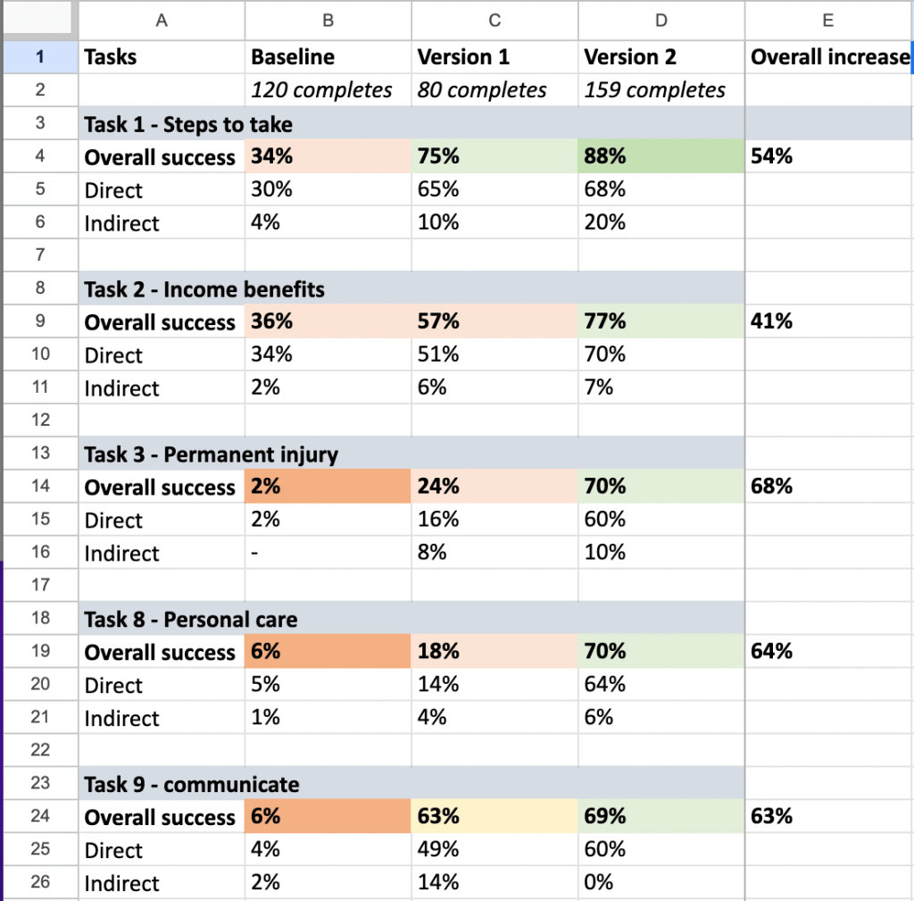
All of the key topics that customers struggled to find in the baseline test showed considerable improvement during Round 2 – one even jumped from 2% to 70%!
Despite the little surprise in the first round of testing, I was able to pivot, iterate, and produce a much more helpful information architecture that significantly improved findability.
After that, I was ready to actually rewrite the pages. The updated pages are available on ICBC.com in the section titled When you’ve been injured in a crash. You can also download this PDF to see an example of how I rewrote a page.
That’s a pretty big impact for a 3-month stint!
Want to see more?
Check out my other case studies or learn a little more about me.

