
Content design case study

When I joined Best Buy’s sponsored ad team as a UX writer, there was a lot to learn. The program allowed Best Buy’s vendors to purchase native ad space on BestBuy.ca to direct more traffic to their products. I quickly learned writing these ads would come with unique challenges:
- Ads could appear nearly anywhere on the site, often out of context
- Templates included very small ad sizes for mobile screens, restricting copy to a very tight 55-character limit
- Some ad templates could not include a CTA (call to action) button or link (i.e. Shop Now)
- The program never had a dedicated UX writer before and previous team members had just adapted the vendor’s copy to fit the character limit
- Vendors now had the expectation that we would use their copy with only minor changes which detracted from our goal of a native ad experience
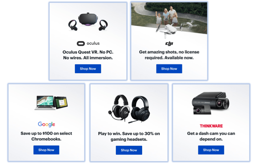
Desktop template example

Mobile template example
Believe it or not, I could already see room for improvement in this process.
The problem
When I asked the team what the biggest problem sponsored ads were facing, they told me this:
There is a significant valley between the highest and lowest performing campaigns. This means the return on investment for vendors is not always consistent, preventing us from growing the program faster.
Sponsored ad problem statement
Since the rest of the team was occupied with other projects, I set out to address the problem on my own. (Eek!)
The research
My research approach was simple:
- Find the top and bottom 5 campaigns over the previous 4 months
- Identify the main creative differences between the 2 groups
- Give qualitative recommendations on how we might improve creative to bridge the gap
I chose click-through rate as the best indicator of creative performance. Other KPIs like impressions or revenue might have reflected other factors like the ads’ placements or the desirability of the product.
Muse headband ad analysis
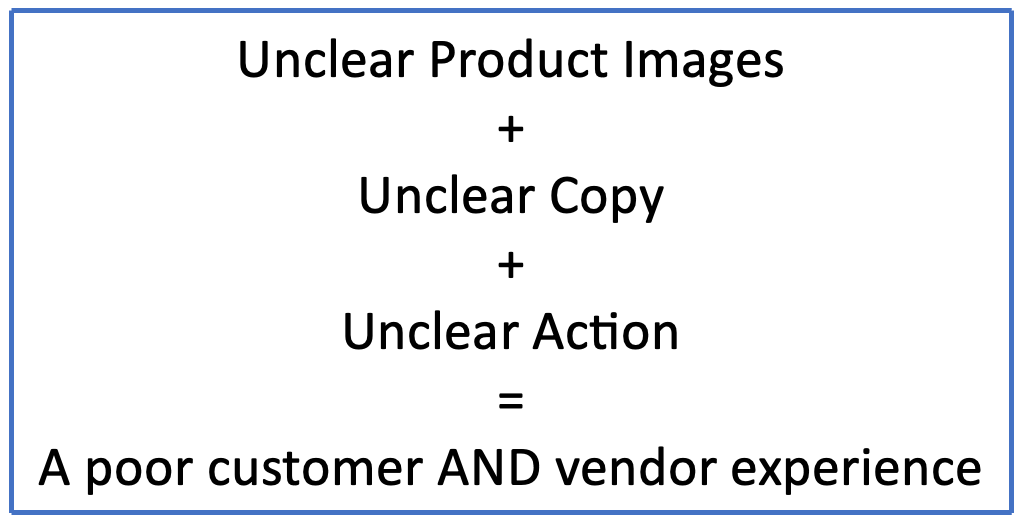
As I examined the 2 groups, some patterns started to emerge. A lot of the issues I saw in the bottom performers were exemplified in this ad for a Muse brain-sensing headband. Let’s take a closer look.

Observations and conclusions
| Observation | Conclusion |
|---|---|
| The product image looks very similar to headphones. Someone unfamiliar with this brand might not understand what this product is or does from this image alone. | Top performing ads feature clearer product images. |
| The copy does not provide any additional information about what this product is. While this copy might work great on Muse’s website, it does not help clear up confusion in the context of BestBuy.ca. | Vendor-provided copy often does not perform well in the context of BestBuy.ca. |
| This particular ad template does not have a CTA button or link (i.e. Shop Now) and the copy does not help to mitigate that. When seeing this banner as a native ad, a customer might not even realize this element is clickable. | Small ad sizes without CTA buttons do not elicit as much engagement. |
In other words:
The solution
All of this was leading up to defining new standards for sponsored ads. However, the space limitations of the smaller ad units meant that visual solutions were limited and most improvements would rely on copy alone. And hey, that’s my job!
To mitigate these issues, I developed these 4 copy design principles for the program:
Be Clear
Be crystal-clear in our messaging and push back against vendor copy when it is not.
Be Concise

Choose only the most essential aspects of the message to stay within 55 characters.
Be in Context

Be aware that customers are seeing these ads out of context and write copy to be more contextual.
Be in Action

Use active language to imply clickability, even when the ad lacks a CTA button.
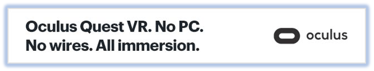
Remember that Muse ad? Rewritten under these new principles, it might have looked something like this: more clear, concise, contextual, and active.

The results
4 months after implementing the new copy principles, it was time to see if they had done the job. Well, break out the champagne because it was a huge success!

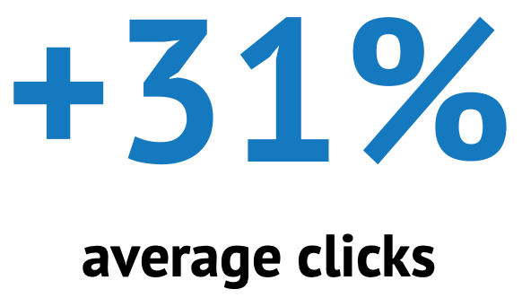

It was pretty clear that I was on the right track. After this little experiment, not only did we make these copy principles a permanent piece of our ad standards, but they also improved the way we collaborated with our vendors. Thanks to me, we now had data and rationale to give vendors when pushing back against their copy. This both helped us create higher quality ads and better reach our goal of a native ad experience on BestBuy.ca.
Want to see more?
Check out my other case studies or learn a little more about me.
