Content design case study

The pandemic was a hard time for everyone, but it was especially complicated for brick and mortar businesses, like Best Buy Canada. Managing these challenges in a user experience that spans both online and in-person touch points is not easy.
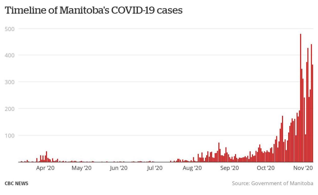
In November of 2020, several Canadian provinces announced new COVID-19 restrictions in response to the rising number of cases that winter. Since many of these provinces were now restricting what kinds of business could be done in stores, this had major implications for Best Buy’s holiday season. The timing was especially bad – when the first mandate was announced just one week before Black Friday! Since Best Buy makes a significant portion of its revenue during the winter months, this could also have a serious revenue impact.

The worst part? As time went on, more and more provinces announced their own restrictions. And no two provinces had the same set of rules.
But never fear! The power of content design (facilitated by me) came to the rescue!
The problem
In response to these sudden restrictions, I was recruited to an all-new, slapdash team of designers to make all the needed updates. We were tasked with 3 problems to solve:
- Give customers the information they need about these new shopping restrictions
- Differentiate the unique restrictions between provinces and regions
- Let them know how they can still get their purchases in time for the holidays
Oh yeah, and with pre-Black Friday sales already in full swing, we needed this done YESTERDAY. So I got to work!
The research
Every great design project starts with research, but how could we possibly fit that into such tight timelines? While there wasn’t time for traditional research, we were in daily contact with our store teams. They let us know about any points of friction in the stores so I could fill any knowledge gaps in the experience.
For example, once they told me customers weren’t understanding the new check-in process for store pickups, I made sure to add more clear information to the relevant touch points.
The personas
Even with the pressure to get this shipped fast, we started the way a design project always should: by empathizing with our user (Best Buy’s customers) and getting aligned on their needs. To help us do this, we created 2 user personas to identify their needs.
Jovial Jolene

Jolene wants to visit Best Buy for holiday gifts in between other errands in her busy life. She’s got a lot to do this time of year, so she hasn’t been paying close attention to the news. Her visit to BestBuy.ca might be the first time she learns about new restrictions in her area.
Jolene wants to figure it out as she goes.
Seeking Susan

Susan is a high-risk individual, and needs to be choosy about where she does her holiday shopping. Before she chooses a store, she needs to know the safety details to decide if she’s comfortable shopping there. But she still needs to buy gifts, and wants that info quickly and easily.
Susan wants to know before she goes.
The solution
After several rapid iterations, we had content patterns that could cover the most common provincial use cases. Move through the image slideshows below to see the whole experience. Since it can be hard to see all the details in these small images, here’s a downloadable PDF that you might find easier to read.
Canada-Wide
The Shop with Confidence page already existed before these provincial lockdowns to house COVID-19 safety information during this time. That’s why we leveraged it to link to out to more detailed provincial information. So you can think of this page as Canada-wide.

When a customer lands here, they immediately see a notification banner that lists all affected provinces. If they are in one of those provinces, they can click the anchor link to bring them further down the page to the map component and identify their province. Here they can get a brief summary of how these stores are effected, and click into a provincial page for more info.
Manitoba
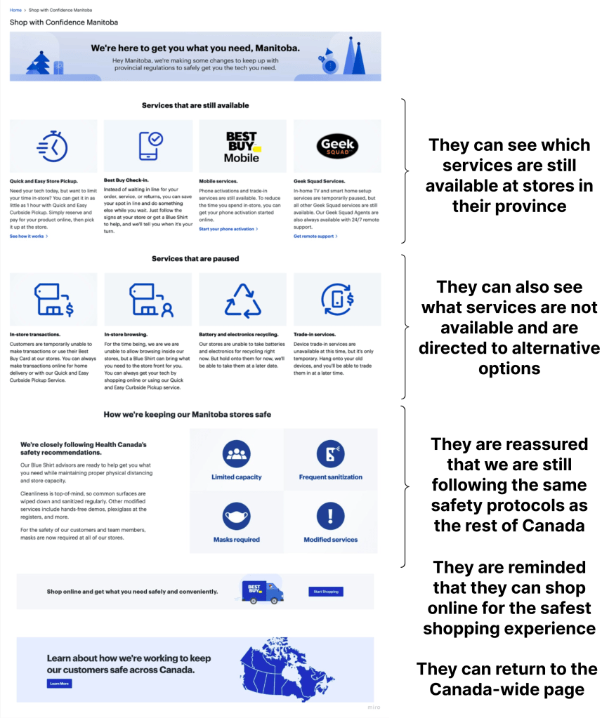
Manitoba was the first province to lock down retail stores, so I modelled future lockdowns after this same information architecture.

Customers immediately see what services are still available in store, along with a link to Best Buy’s help centre for more information. Next they can see the services that are paused. Whenever a service is not available, the content directs them to an alternative. Just below, they are reassured that all the Canada-wide safety protocols still apply to Manitoba stores. At the bottom, they are encouraged to shop online since it is the safest way to do so.
Ontario
Ontario’s restrictions were a bit different from the others. Instead of applying to the whole province, Ontario’s rules only applied to the high-population areas of Toronto and Peel. For this reason, I created a modified version of the Manitoba architecture for this use case.

At the top I used a similar pattern to the Canada-wide page with an anchor link that can bring the customer down to the affected regions. There they can see any store closures in the area, plus the services that are available and not available, just like the Manitoba pattern.
The holistic experience
These landing pages were mostly straightforward, but I quickly realized that they wouldn’t be enough. For a topic this important, I needed to make sure I could inform our customers at all points of their journey.
Touch points for Jolene
Jovial Jolene got us thinking about holistic touch points throughout Best Buy’s ecosystem. Remember, Jolene needs to find this information along the course of her journey, so I had to anticipate how she might enter BestBuy.ca to identify the right touch points.
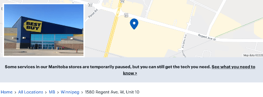
In this example, I realized if Jolene is committed to visiting a store, she might not shop on BestBuy.ca at all. Instead she might just check a store locator page. So I created this banner content for stores in affected areas to grab her attention and direct her to the relevant Shop with Confidence page.

Here are a few more examples of touch points where I added messaging:
- A global, site-wide pencil banner leading to the main Shop with Confidence page
- Partnered with our SEO team to update our store pages on Google Maps
- Partnered with our email marketing team to add information to store pickup emails
Knowledge for Susan
While Jolene is likely to stumble upon the info she needs, Susan is going to seek out all the details. That’s why she got us thinking about how I could best deliver more detailed knowledge to her about these new practices and protocols.
The pages were already linking to articles in our help centre, but these articles hadn’t been prioritized in the past and were… not the best reading experience. For the next iteration of the holistic experience, I simplified the language in these articles and partnered with a visual designer to add icons and visual steps to make them more scannable.

The results
A project this rushed can be hard to measure. But we succeeded in getting the basic information available to our customers within a week (before Black Friday), and then were able to fill gaps within the holistic experience over the following month. We also had a few other wins and indicators of success:
- Improved metrics showed that customers were able to find the info they needed (bounce rates decreased, scroll depth increased)
- Over time, there were fewer and fewer complaints from the store teams showing customers now knew what to do before they got to the stores
But we had one more thing: the Pandemic Playbook. All of our iterations meant we now had a set of design patterns that could fit the most common lockdown scenarios. With ready-to-use content and assets, we could implement a new provincial page and update all relevant touch points within a matter of hours instead of a matter of days.
And when you’re working overtime during the holidays, that’s a huge win!
Want to see more?
Check out my other case studies or learn a little more about me.
